Virginia Votes 2012
Now that the votes are cast, we have some real electoral data to explore. My first question was how the distribution of Obama’s vote in Virginia in 2012 compared to 2008.
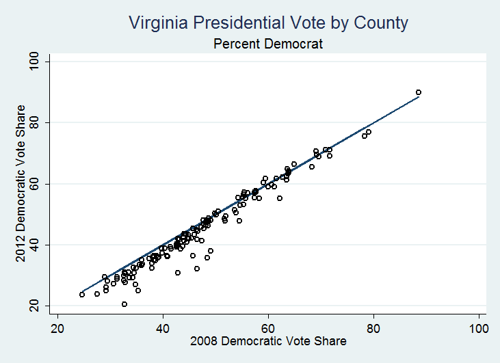
Using the unofficial results currently reported by Virginia’ State Board of Elections (with 2,573 of 2,588 precincts reporting), I plotted the percent of votes cast for Obama in 2012 and 2008 by county. The diagonal line shows the point at which vote shares in 2012 are the same as in 2008.

The first thing that jumps out is that Obama fared worse in 2012 almost everywhere — most of the points (representing Virginia counties and independent cities) are below the diagonal line. This make sense given his share of the vote in the state as a whole declined from 52.6 in 2008 to 50.7 in 2012. Obama’s share of the vote increased in only 19 localities, and in 10 of these the increase was less than 1 percent. The table below shows the localities where Obama’s vote share increased by more than 1%:
| Obama 2008 | Obama 2012 | Increase | |
|---|---|---|---|
| Manassas Park City | 55.4% | 56.6% | 2.3% |
| Hopewell City | 55.5% | 57.4% | 1.9% |
| Hampton City | 69.1% | 70.7% | 1.6% |
| Emporia City | 65.0% | 66.5% | 1.5% |
| Danville City | 59.1% | 60.5% | 1.4% |
| Franklin City | 63.7% | 65.0% | 1.3% |
| Petersburg City | 88.6% | 89.9% | 1.3% |
| Prince Edward County | 54.3% | 55.5% | 1.2% |
| Covington City | 55.4% | 56.6% | 1.2% |
Obama gained support in some localities he won comfortably in 2008, and these gains tend to be mostly in localities where more than a third of the population are minorities. Similarly, we can look at places where Obama’s vote share declined by 6% or more:
| Obama 2008 | Obama 2012 | Decrease | |
|---|---|---|---|
| Buchanan County | 46.5% | 32.1% | -14.4% |
| Dickenson County | 48.5% | 35.8% | -12.7% |
| Tazeweell County | 32.8% | 20.6% | -12.2% |
| Russell County | 42.9% | 30.8% | -12.1% |
| Norton City | 49.1% | 37.9% | -11.2% |
| Wise County | 35.3% | 25.1% | -10.2% |
| Buena Vista City | 45.7% | 36.4% | -9.3% |
| Lee County | 34.9% | 27.0% | -7.9% |
| Lexington City | 62.2% | 55.3% | -6.9% |
| Westmoreland County | 54.6% | 47.8% | -6.8% |
| Lynchburg City | 47.4% | 41.4% | -6.0% |
Obama saw his support decline mostly counties he lost in 2008, and mostly in counties in Southwest Virginia’s coal country (places that also happen to have a very large percentage of whites).
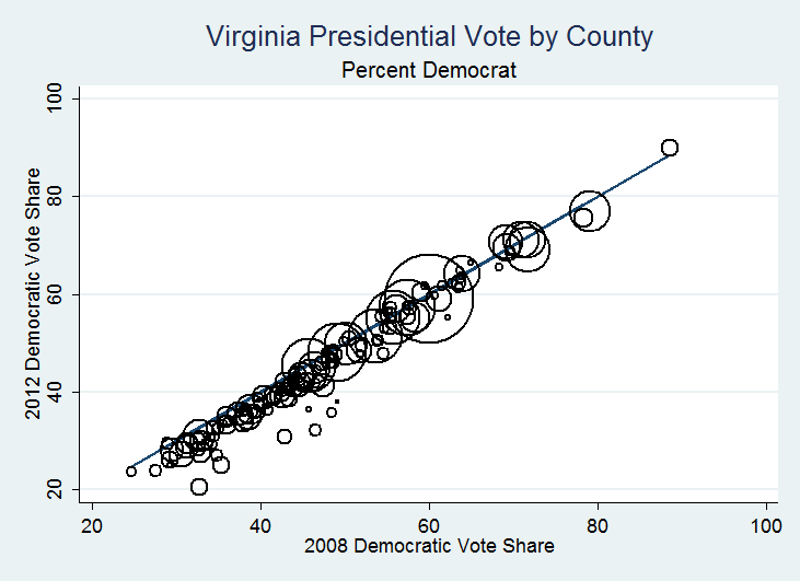
But localities are not equal, at least in terms of their influence in Virginia’s electoral outcomes. Importantly, in Virginia’s most populous localities, 2012 looks a lot like 2008. The following graph plots Obama’s 2012 vote share by his 2008 vote share again, but this time, weighting the localities by the total votes cast in 2012. The biggest circles, representing the most populous counties, are mostly centered on the diagonal line.

In short, despite a decline in Obama’s vote share throughout the state, the distribution of the 2012 vote looks very similar to that of 2008. The biggest differences occurred outside of Virginia’s major population centers and in counties with large percentages of white voters — illustrating the challenge Obama faced in building support among white voters not only in Virginia but across the nation.
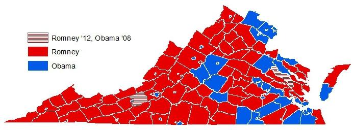
And for the map-lovers, here’s red-blue Virginia…


