Taking a look at fertility trends
“All models are wrong, but some are useful” – George Box
Trying to predict the future is a risky business because it is inherently uncertain, but we need to do so in order to plan.
The Cooper Center recently released Virginia population projections for 2020-2040. The projections were developed by extrapolating historical population trends. As part of our comprehensive research efforts, we also study population change in terms of births, deaths, and migration (though our official projection model does not require these input data, historical population trends are driven by trends in components of population change). This blog post focuses on how U.S.A. fertility rates have changed over time and how they might look in the future.
Total Fertility Rates

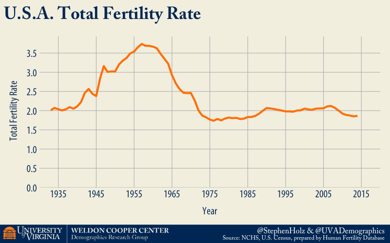
The total fertility rate (TFR) is the most frequently used statistic to describe birth trends. The TFR for a given year is the number of children a hypothetical woman would have in her lifetime if she followed the age-specific fertility rates (ASFR) observed in that year. The chart above shows U.S.A. TFR grew from about 2 children per woman in the 1930s during depression to more than 3 during baby boom. Currently, the TFR is slightly below 2 children per woman.
Age-Specific Fertility Rates

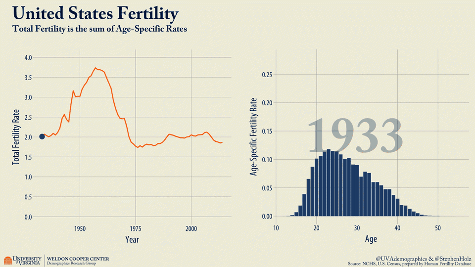
In addition to the TFR, the underlying ASFR curve has trends as well. In early dates, women more often had their babies in their late teens and early 20s; increasingly, women are having babies in their late 20s, 30s, and even early 40s. Chart 2 above illustrates how the TFR and ASFR are linked and how the timing of women’s births by age has changed over time. The change of timing can have a profound impact on the total number of births. A later start often suggests a lower number of births, as a woman’s childbearing years typically end around 45.

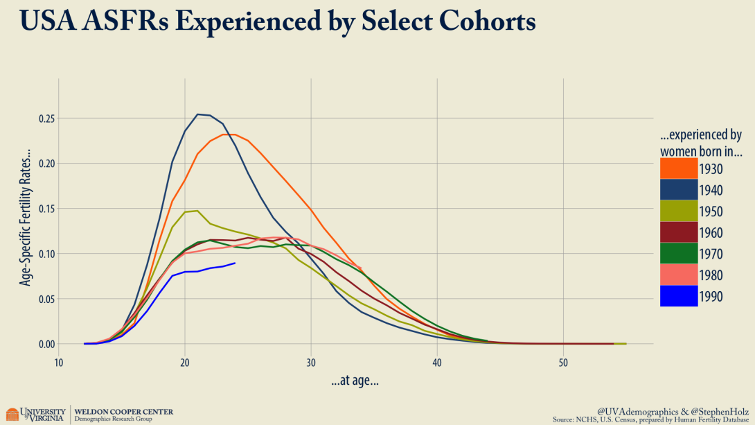
We have to look at generational trends as well. How many total babies are young couples/women aiming to have? If they start slow, will they try to have more later? The chart above shows 7 different cohorts of women by decade they were born in. Those born between the 1930s to 1960s have completed their childbearing years, and have the full curve to show both the total number of children (area beneath the curve) and the timing (age) of the births. Others, such as the 1980 and 1990 cohorts, do not have a completed curve yet as they are still in the midst of childbearing years, but they are starting later than previous generations and their current peaks are blunted compared to those of pre-1960 cohorts.
Visualizing Uncertainty in a Fertility Forecast
For illustration purposes, I’ve chosen a model easily implemented using the “demography” and “forecast” R software packages published by prominent forecaster Rob Hyndman. The fertility data used here is curated by the Human Fertility Database and easily accessed using another R package “HMDHFDplus”, authored by Tim Riffe. Full code is available on my github.

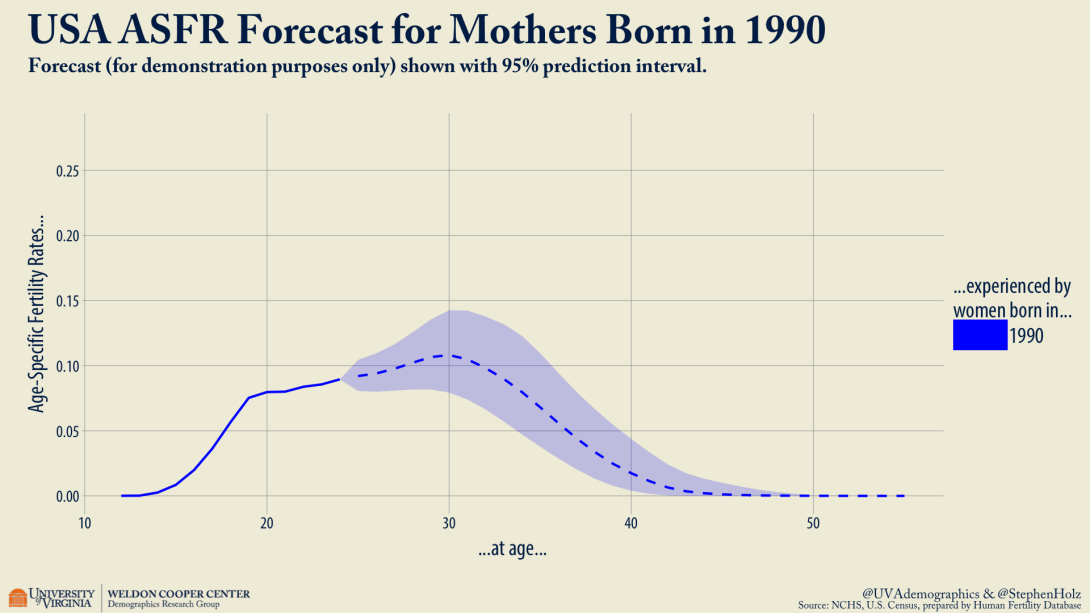
With detailed historical data going back to 1933 and some math, the model captures the overall downward trend and shift to older ages while accounting for historical levels of variance that could allow future trends to drift in either direction. Looking at just the 1990 cohort, the forecasted ASFRs suggest there is a chance they outpace the other selected cohorts in later life despite a slower start. The shaded area shows the range of a 95% prediction interval.


