Same old story… U.S. is getting older and more diverse
This is my third and final blog post about the Census Bureau’s special report on Patterns of Metropolitan and Micropolitan Population Change: 2000 to 2010. My first two posts covered information from the first three chapters of the report – the basic information about urban areas and an overview of their population change in the last decade and population density in the United States. In this post I’ll present the biggest takeaways of the final two chapters, which provide data on race, Hispanic origin, age, and gender composition.
According to the report, in 2010, about 67 percent of U.S. residents were non-Hispanic White, 16 percent were Hispanic, 13 percent were Black, and just under 5 percent were Asian. Looking at the racial composition of urban and rural areas, we find that cities with larger populations are more diverse. In 2010, just over 80 percent of the rural population was non-Hispanic White. That share was less than 50 percent in large metro areas with 5 million people or more. The trend is similar for the American Indian and Alaska native populations, which also have the highest concentrations in rural areas. When we examine the different parts of the country by increasing population size (moving from rural areas to small, then medium, then large cities), we find increasing shares of Hispanics, Blacks, and Asians. The Native Hawaiian and Other Pacific Islander population shows no increasing or decreasing trend as we look from the most rural to the most urban areas.
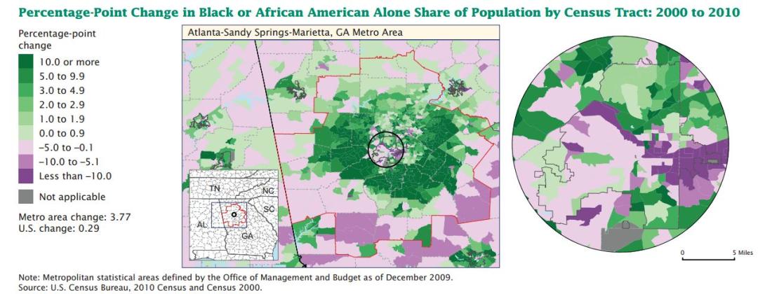
Locally, the distribution of race and ethnicity groups varies and also has changed since 2000. For Blacks there were two major trends in most large cities – decreasing concentrations in the central cities of large metro areas, and increasing suburbanization. The image below (click on the image for a larger view) is from the report and shows an example of this trend in the Atlanta metro area. The small black circle in the center of the map is the central city of Atlanta, and the space between the circle and the red border is the Atlanta suburbs. The trend toward the suburbs is shown by the green shading (representing increasing concentrations) in swaths right outside of and around the central city. Within the central city there are many purple areas, showing declining concentrations of the Black population there.

The Hispanic population typically increased in the largest metro areas, growing mostly along central city perimeters and in suburbs. Conversely, the non-Hispanic White populations tended to show decreasing concentrations in the suburbs and increasing concentrations in many of the central cities themselves. This represents a resurgence of this population group in the urban cores.
Looking at age composition, the aging trend in the U.S. was evident. In 2000, the median age in the U.S. was 35.3. This number was up to 37.2 by 2010. Overall, metropolitan areas are the youngest and rural areas are the oldest, but the median age increased in all three types of areas: metropolitan, micropolitan, and rural. The cities with the highest median ages were mainly in Florida and Arizona, though the second oldest city in the U.S. was in Massachusetts. The youngest cities were those that included the college towns of Kansas State University and Texas A&M University, as well as two cities in Utah and one city (Jacksonville, NC) with a military base.
Looking at gender composition, we find that in 2010 females outnumbered males in the cities, but males outnumbered females in rural areas (the latter was not true in 2000). Overall, men tend to outnumber women out West, while the opposite is true in the East.

Overall, these chapters of the report do not reveal anything surprising. We are in the midst of strong trends of population aging and diversifying. But this report is an excellent resource for finding all of the data in one place, and it includes a lot of informative and useful tables, charts, and maps. Additionally, the Census Bureau has provided downloadable files of much of this data. The tools accompanying the report come in the forms of an interactive map viewer and Excel files. The Excel files include data by Chapter, data and charts on age and sex structure for all metro areas, and population density data and profiles for all metro areas. This report provides an excellent overview of changes in the U.S. since the last decade, and the accompanying tools can be extremely useful when evaluating your local area.


