The geography of Virginia’s presidential primary
Hillary Clinton won a majority in the Virginia Democratic primary on March 1st, while Donald Trump took a plurality of voters in the Republican primary. The Republican primary generated record voter turnout. Nearly 4 times as many votes were cast in the 2016 Republican primary as in the 2012 primary.
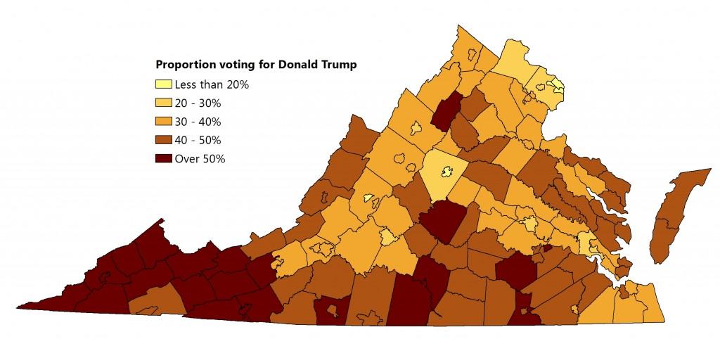
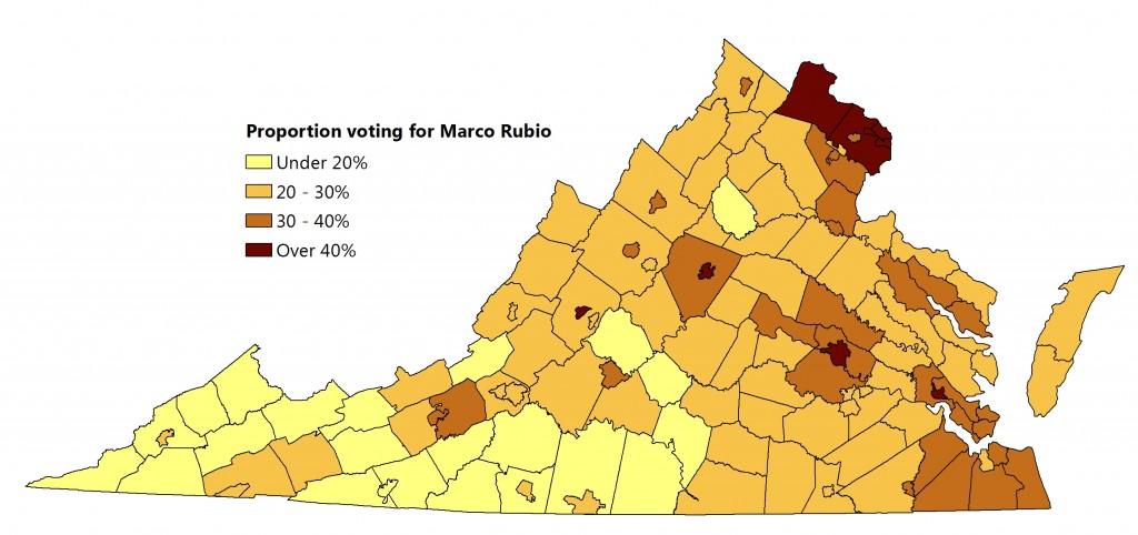
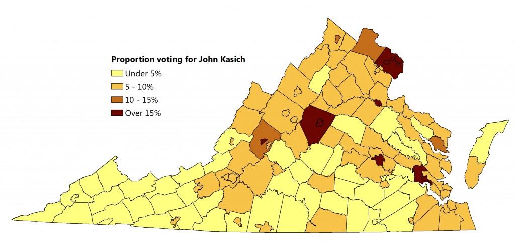
Below are a series of maps showing the percentage of the vote captured across the Commonwealth by each candidate.
Donald Trump dominated Southwest Virginia and many other rural counties, but still received a substantial portion of his votes from urban areas, especially Hampton Roads. His best county was Buchanan, which gave him nearly 70% of its votes. His worst county was Falls Church, with just under 16%.
Marco Rubio’s strong counties were roughly opposite to Trump’s. Rubio took nearly 50% of the vote in Arlington County, with Alexandria, Charlottesville, and Richmond close behind. He performed worst in the southwest corner of the state, taking less than 14% in Buchanan County.
Ted Cruz was strongest in the south central part of the state, especially the counties around Liberty University, where he first announced his campaign. His top finishes came in Bedford County (30%) and in the City of Lynchburg (29%), where Liberty University students largely ignored school president Jerry Falwell, Jr.’s endorsement of Trump. Cruz did worst in Northern Virginia and Hampton Roads, getting less than 8% of the vote in Alexandria and Arlington.

Carson’s support was more like a steady background noise, but he also did better in the counties around Lynchburg, as well as in the Shenandoah Valley and Northern Neck. His best county was Lunenberg, where he received 13% of the vote and his worst was Alexandria, with only 2%.

John Kasich did well in the urban crescent, taking about 23% of the vote in Arlington, Alexandria, and Falls Church. He did poorly in rural areas, getting only 2% of the vote in Cumberland County.
On the Democratic side, Hillary won all but 16 counties. She was strongest in Southside and Southeast Virginia, taking over 90% of the vote in Sussex County. Bernie Sanders did best in Floyd County, where he received 70% of the vote.

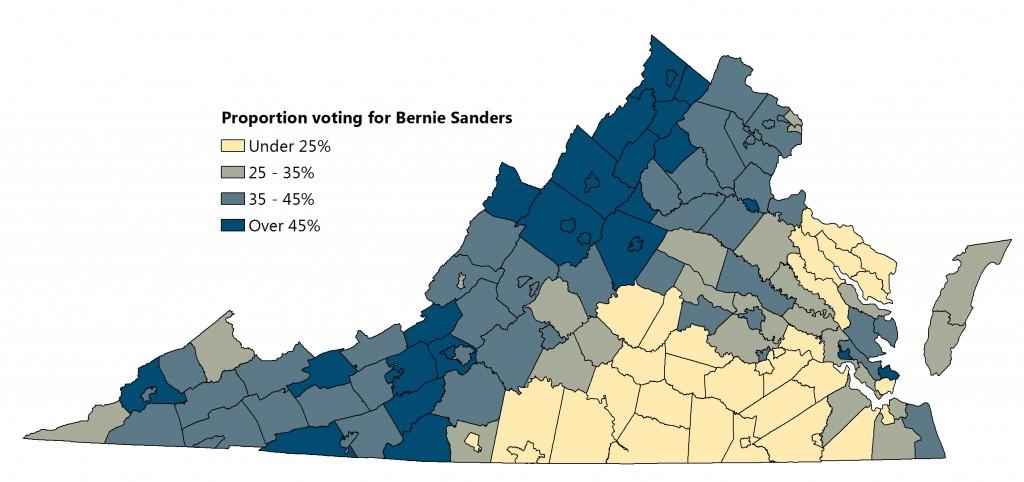
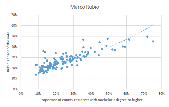
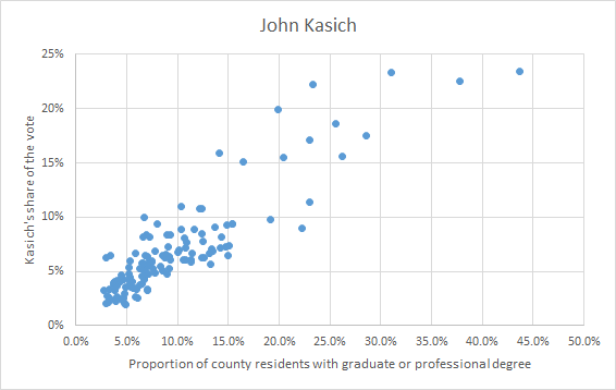
There are some obvious patterns visible in both maps, but I pulled some demographic data and ran correlations to see which patterns were clearest. The Republican race overwhelmingly pit urban and high-income counties against more rural counties. Cruz and Carson’s support didn’t follow any of the standard demographic variables very closely, but the share of the vote taken by Trump, Rubio, and Kasich was most strongly predicted by educational attainment.
As shown in the scatterplot below, counties with lower percentages of college graduates voted overwhelmingly for Donald Trump. Counties with more college graduates were more likely to vote for Marco Rubio or John Kasich:


Interestingly, when the graph is based on graduate and professional degree holders rather than just bachelor’s degrees, the correlation weakens significantly for Rubio, but strengthens for Kasich:
On the Democratic side, the situation was different. Educational attainment and income weren’t great predictors of a county’s vote. Instead, the strongest prediction of a county’s vote was the percentage of residents who identified as African-American. Counties with more Black voters went overwhelmingly for Hillary Clinton.
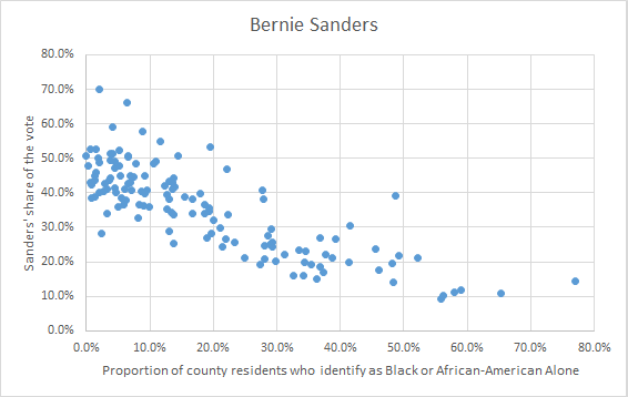
While these correlations only show geographic overlap, exit polling largely confirms their importance.


